The Good, Bad and the Ugly side of Advertising
Creative Advertising makes me THINK
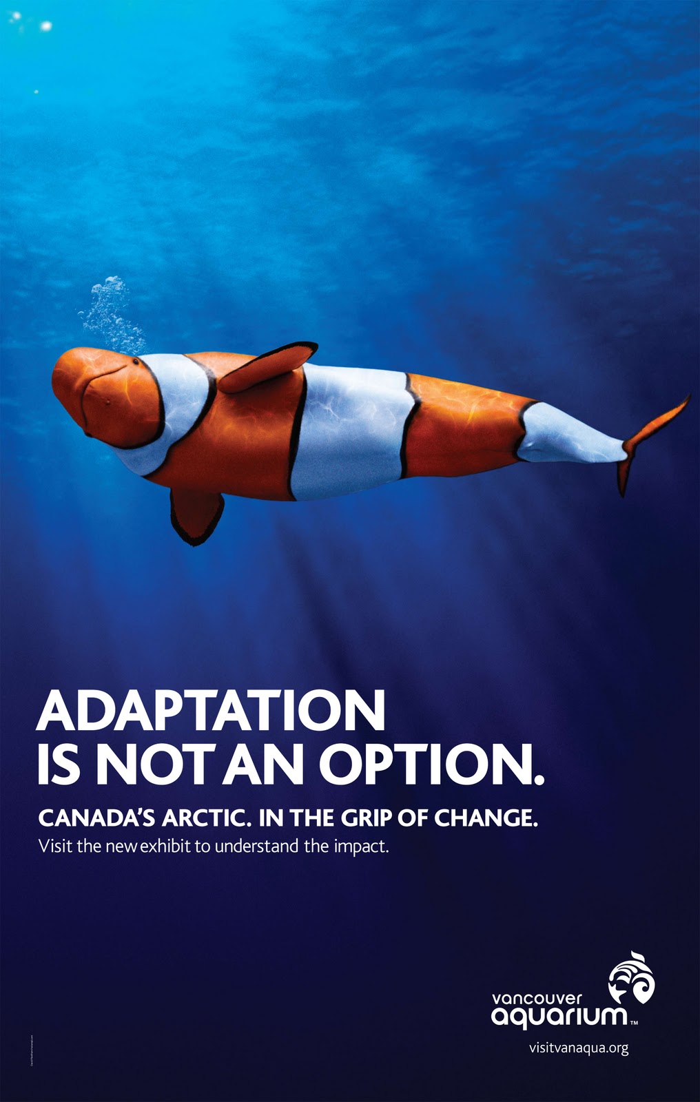
This is a clever playing with color, the color played the major part of the design workflow creating an attention for the message and the same time it delight and entertain the viewer as this is what advertising should do!
Break Down: Complimentary Color using Orange vs Azure and black and white as contrast. Orange color to represent clown fish color. While the blue darken as it moves from top to bottom giving the depth of the water as our eyes focus on the top part of the image
Interesting Advertising for the curious mind
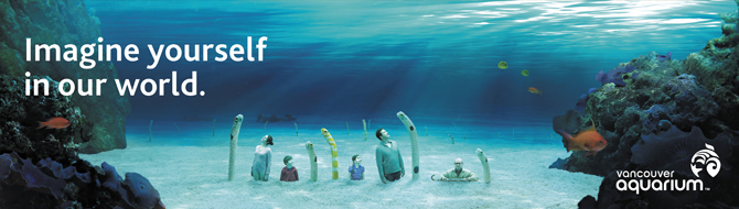
I enjoyed this advertising as it has a balance of warm and cool color as it has Violet, Red, Rose, yellow, orange, Cyan, Azure, Blue and Spring colors. The Boy’s shirt is Magenta color with 20% saturation and 42% brightness even though it is a warm color it became a neutral tone. While the Fish is green 40% saturation and 54% brightness. With this image ALL three primary color were used ‘Red, Green, Blue’.
Break Down: Complimentary colors Warm against Cool
Red vs Cyan
Orange vs Azure
Yellow vs Blue
Magenta vs Green
Rose vs Spring
Hurt my head Advertising
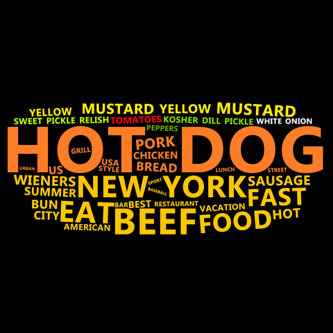
I really LOVE this advertising as it makes my head hurt if that is the idea it worked very well! Try to look at this image for 10 seconds mind you five second will bring blood to your eyes.
Here is the break down: Four colors were used. Green, Yellow, Orange and Red. Yes that is ANALOGOUS, having three HOT colors and one Cool color trouble is the coool color is saturated as it gives the hot affect feeling. The crowed hot colors are too strong for anyone trying to read the message. This is a classic BAD and Ugly communication advertising.