Wedding Photographer Study Color Theory – Split Complimentary
Wedding Photographer Study Color Theory - Split Complimentary
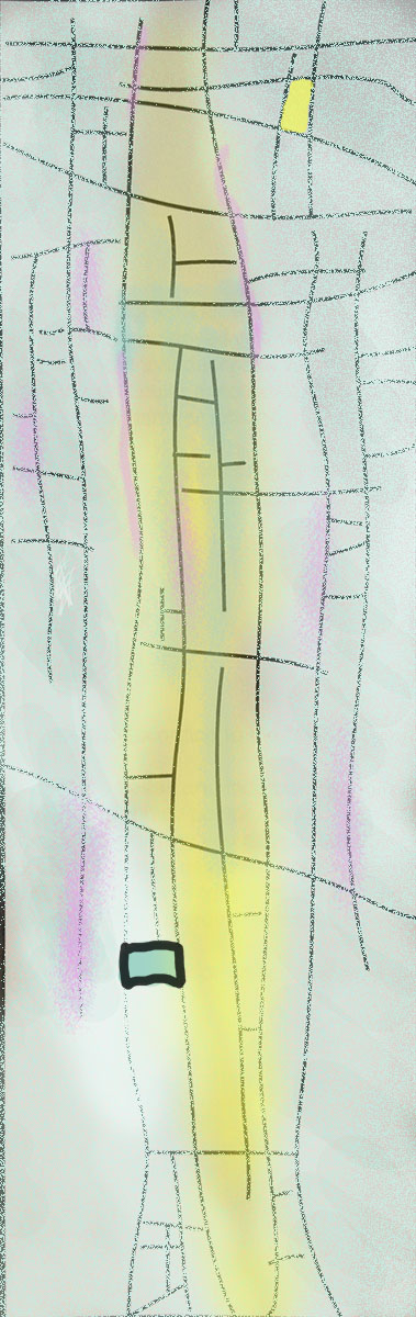
Color Painting by Wedding Photographer Study Color Theory – Split Complimentary. I use Split complimentary color of Yellow, Blue and Magenta. The cool blue I have desaturated more to give a soft feel while the warm color of yellow and magenta also desaturated and tone down the values. I use Magenta to create depth while the yellow sits quietly with the flow of the lines and pushing the curves forward. I have created two elements from the top and bottom; the top small box with more saturated yellow while the bottom with most saturated blue from the image with a strong bouncing black box outline, these elements kept the image balance and interesting.
To be a GREAT ARTIST for digital and Traditional Paintings, one must understand theories of color even though there are different theories for Digital and Print medium. Critical knowledges are important for Color Grading in Post Production workflow or creating cinema movie LOOKS.
Vancouver Filmmaker Color Grading